Menu
Close

September 22, 2020
Identity Redesign Case Study
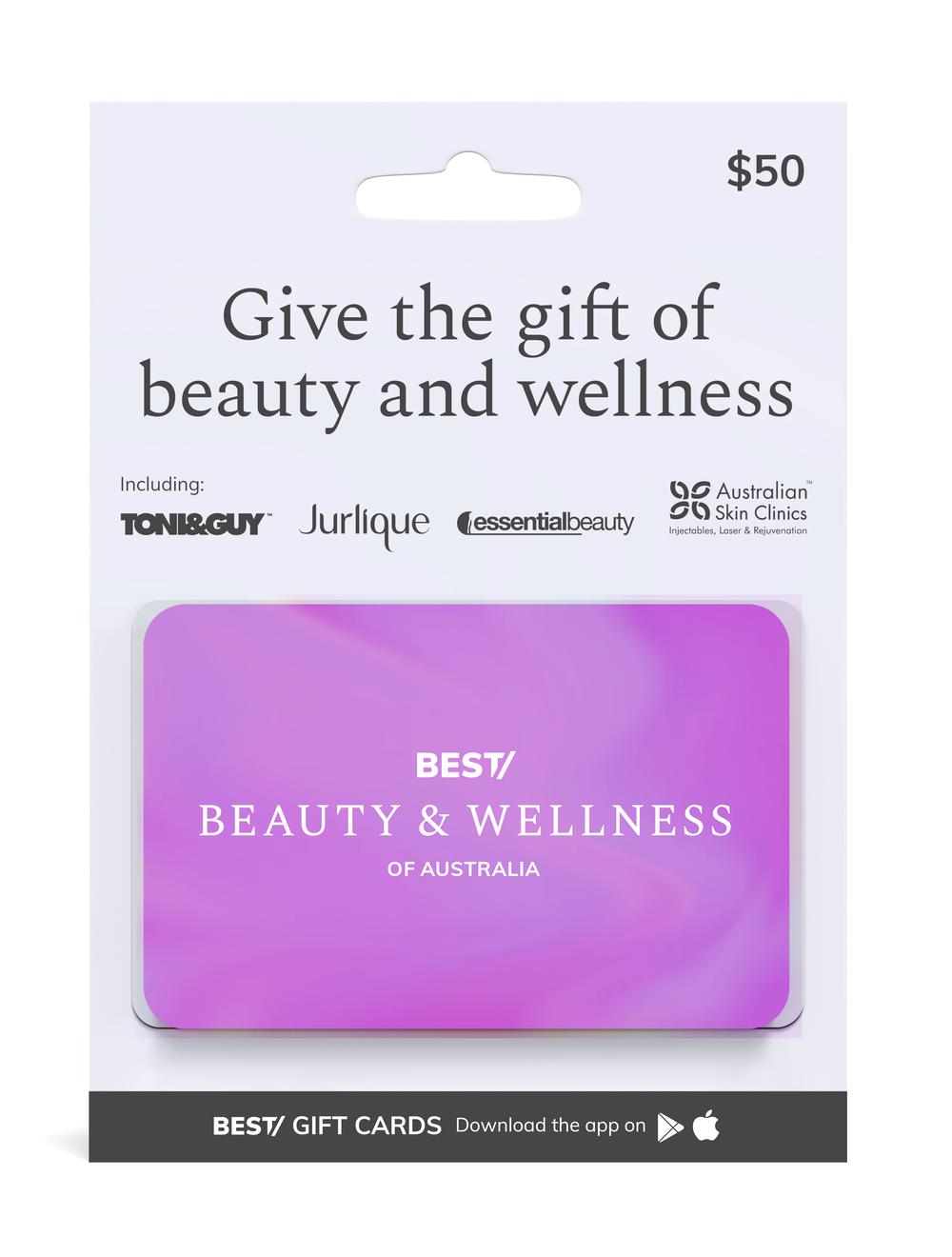
Established in 1994, Best of Australia by de Groots Media is a hospitality and tourism offering with marketing opportunities such as curated, selective and exclusive lifestyle experiences and a range of gift cards. Faced with newer challenges in the current times, The Best of Australia brand was in need of rebranding to create a modern and memorable identity along with a cohesive visual language.

One of the main challenges of the project was to bring together the various product brackets under the Best of Australia brand. The visual language then had to be adapted for print and mobile.
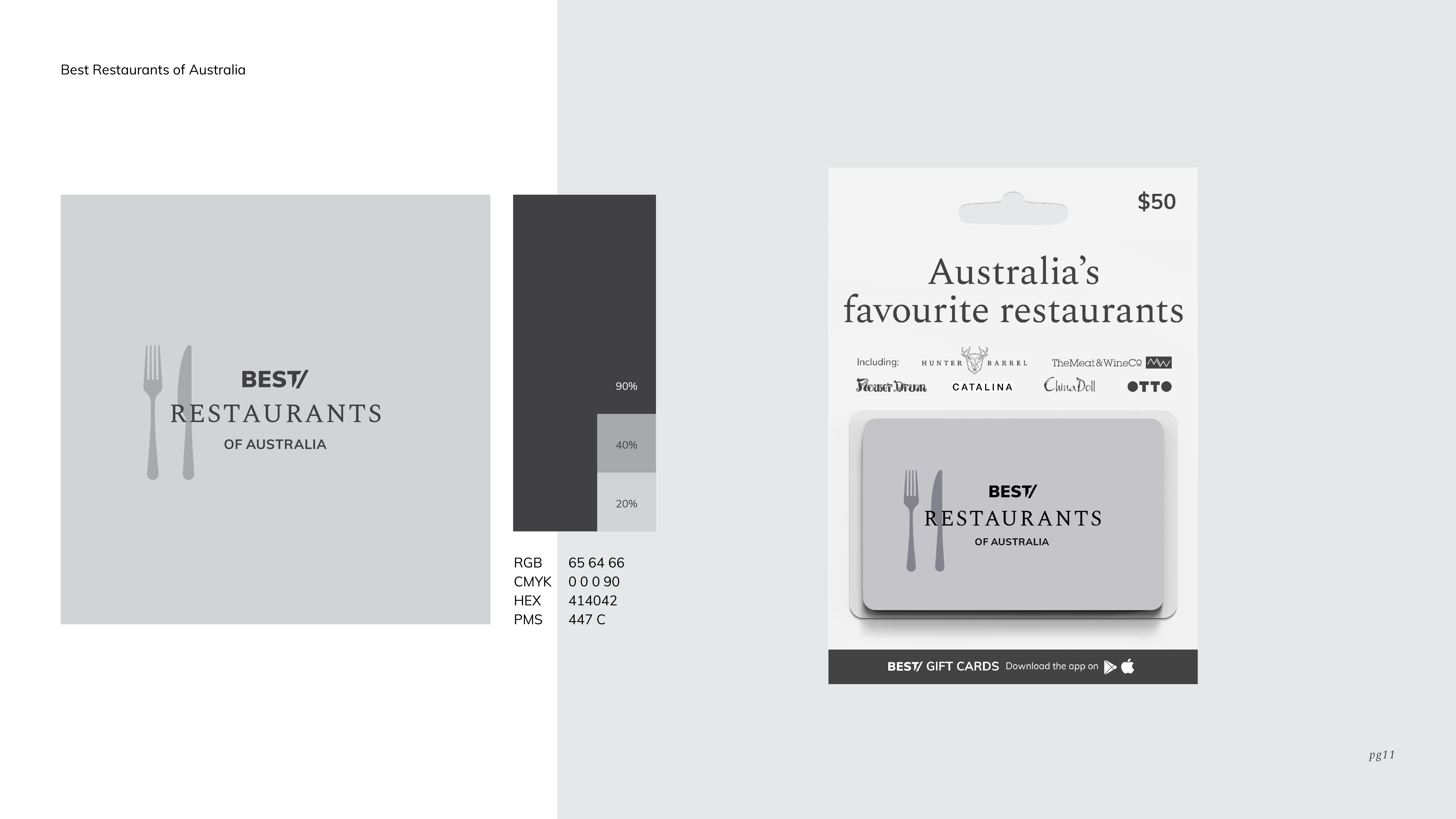
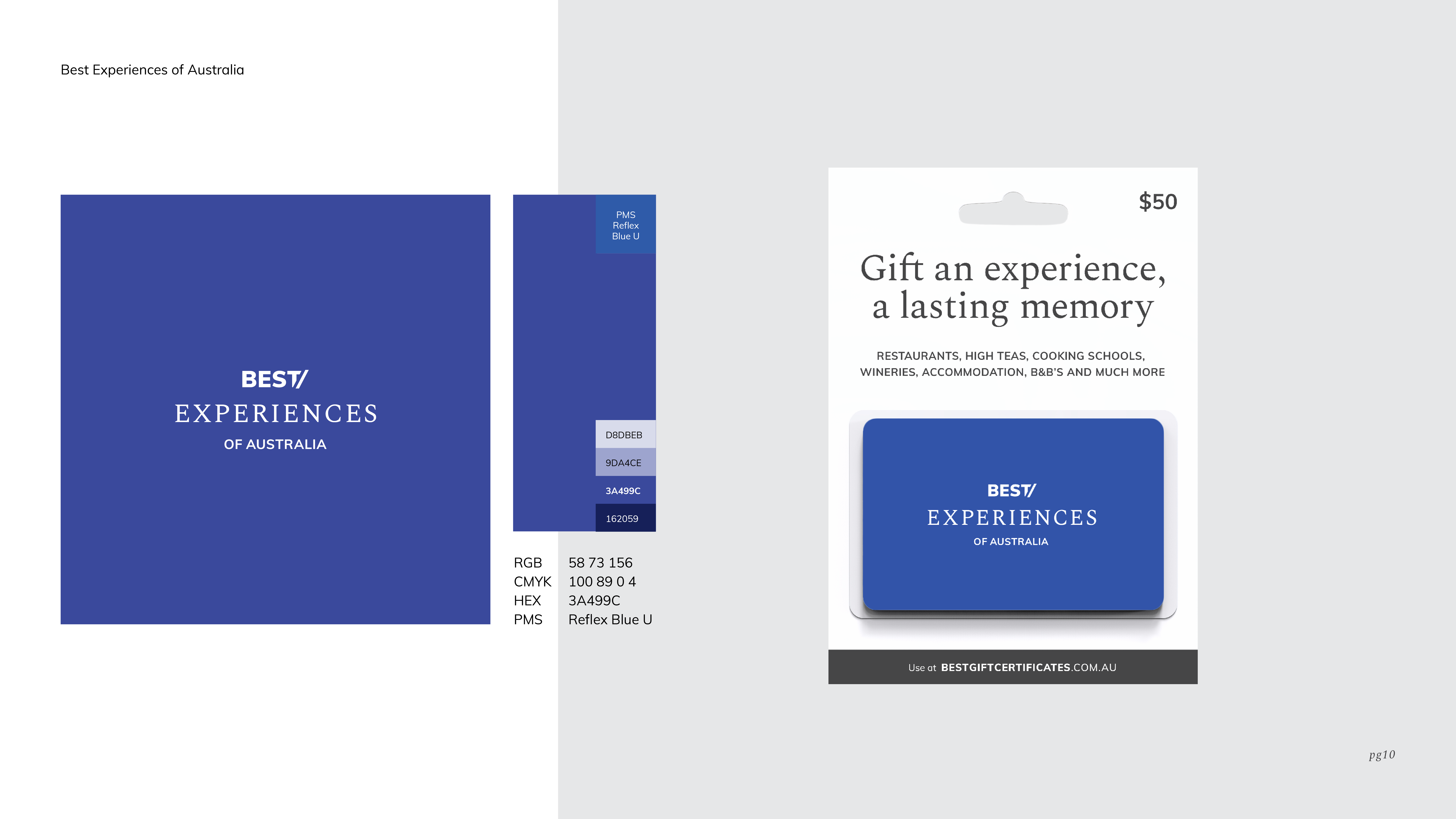
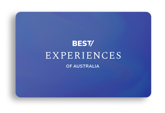
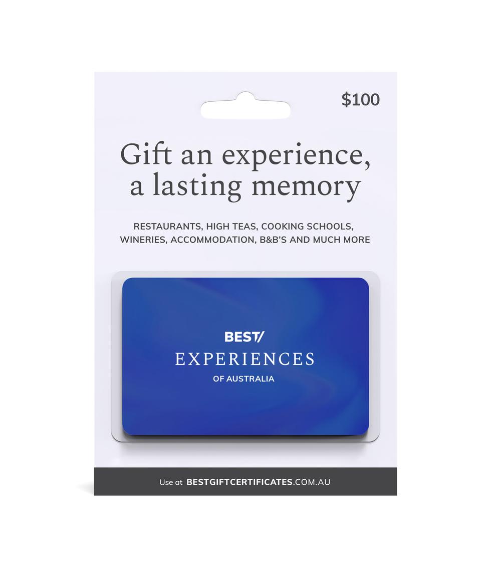
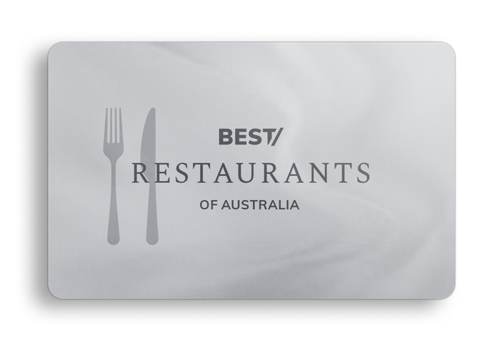
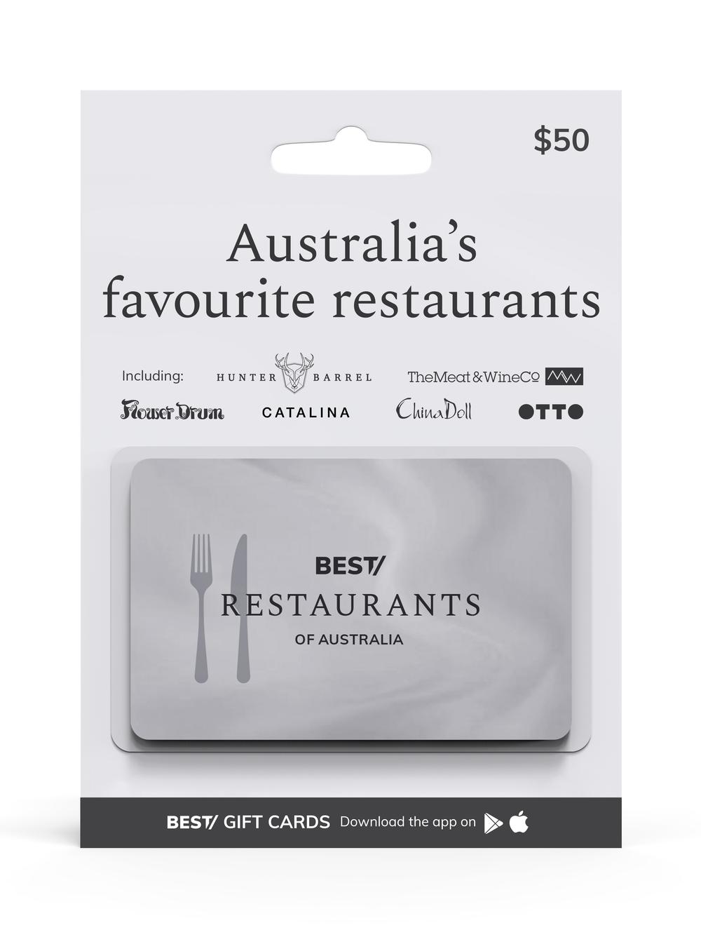
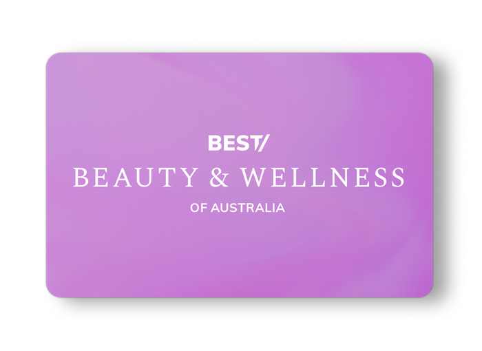
Lifestyle, Culture, Experiences, Beauty,Wellness, Restaurants, Hotels, Venues, Pets & much more.
The Best of Australia Group logo is constructed using a stylistic treatment of the Muli typeface. A wordmark composed of a unique typeface such as Muli embodies its sharp yet rounded features to finally emanate a sense of sophistication and warmth. This logotype becomes the primary identity for the brand which is to further encompass a wide range of products.
Web safe and open source made available via Google Fonts.
Muli Font Family fonts.google.com/specimen/Mulish
Spectral Font Family fonts.google.com/specimen/Spectral


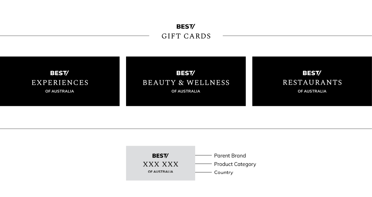
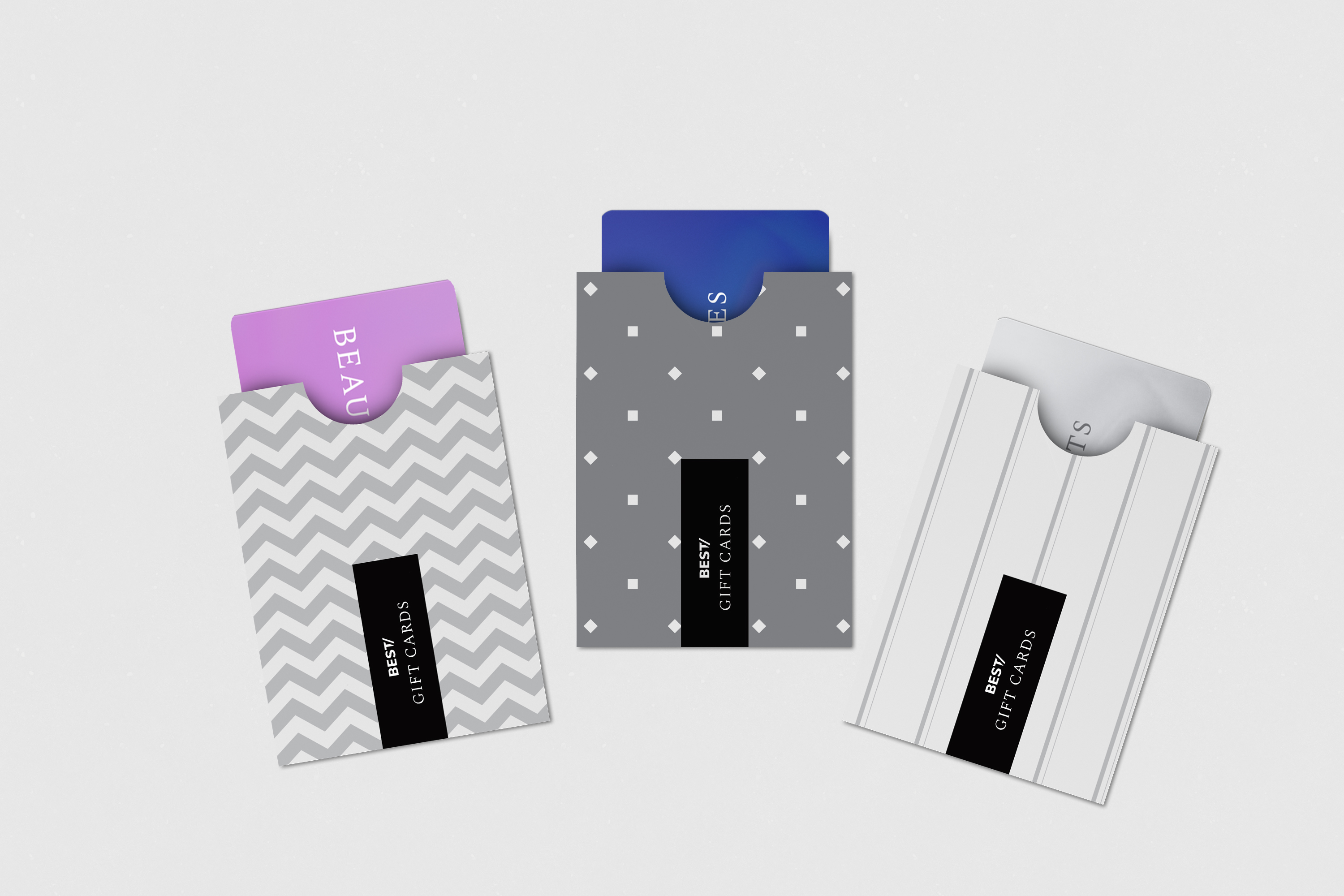
The alternate logo for Best of Australia Group is an adaptation of the parent logo to be used in smaller sizes. This allows for better legibility in cases of constraints. The alternate logo has very limited application and is to only be used in case of a size requirement below 4px. The logo unit is also visualised as a tape for a more dynamic application of the brand language. As shown, the unit can be adapted for various product and country extensions. The icon is composed of the initials of the brand name, to be used only in cases of major space constraints. The icon can also be used as a brand mark for application in mobile apps, websites, stamps, etc.

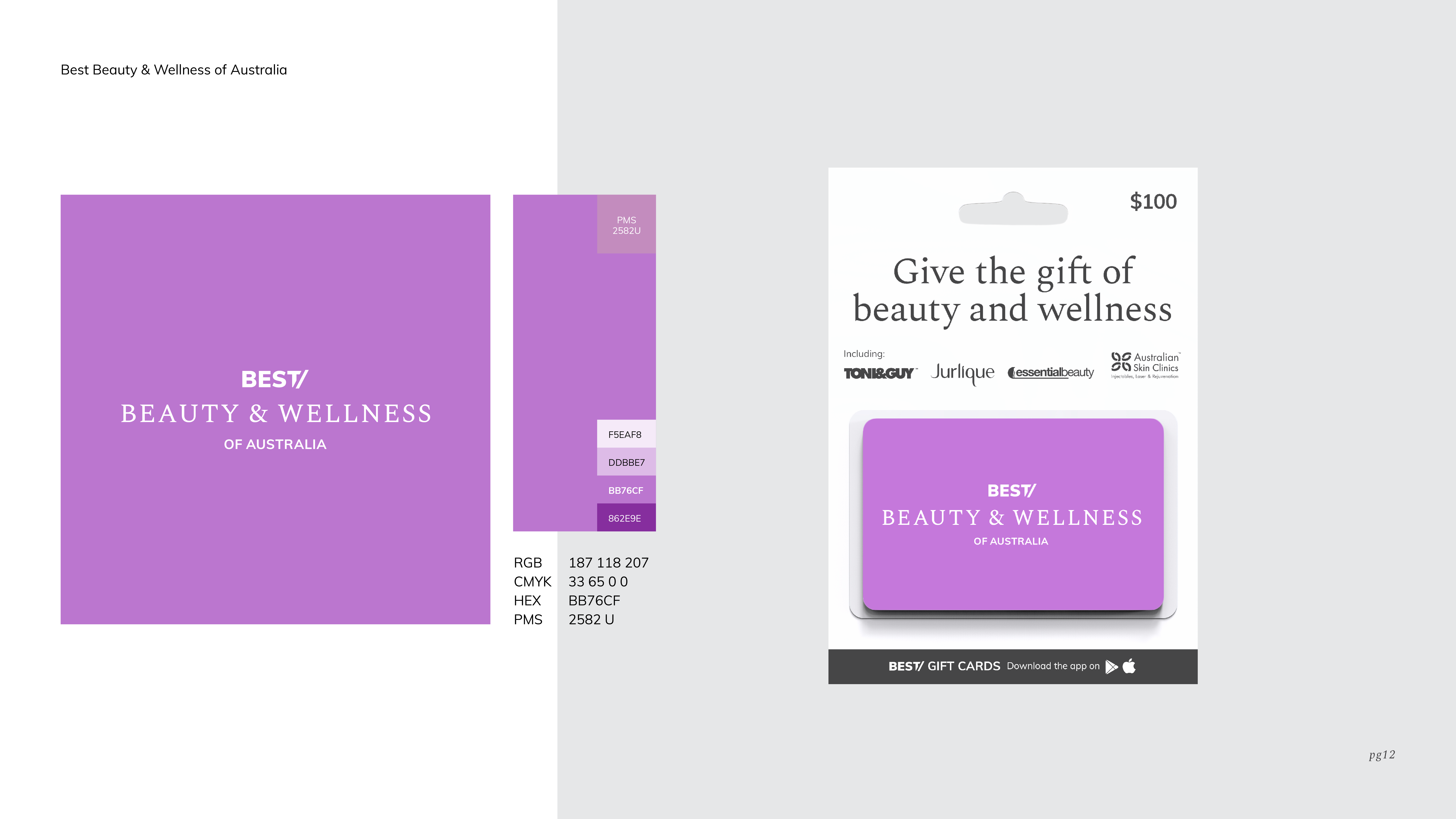
The identity is extended to include the Best of AustraliaGroup's diverse product offering. The product category uses the Spectral typeface in regular and small caps.The following extension can be used in communication for specific products under the parent brand.
The logo for Best of Australia Group and all its extensions are constructed using fixed proportions in order to create a consistent brand language. The area of isolation is a buffer zone of neutral visual space that surrounds the logo to prevent visual interference from other graphic elements. The isolation zones as illustrated below are applied consistently all around the area of the wordmark. These zones must always be maintained to enable clarity and legibility.


When the Best of Australia Group logo is used in partnership with logos from other organisations or brands, the defined proportions are maintained. The height of partner logos should always be equal to the height of the Best of Australia logo such that they are equal in visual weight. Using any of the logo units within the Best of Australia family in partnership with logos from other organisations or brands, the height of the partner logo should always be equal to or less than the height of the Best of Australia extended logo such that they are equal in visual weight.

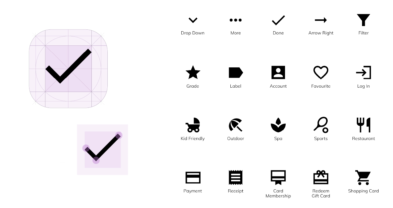
Complete icon library available via Material Design by Google material.io/resources/icon
Theme in use: Sharp
The following style guide has been created for various web and app based application.


All rights reserved. de Groots Media